Tested by Javier Origin · Colored pencils
Van Bleiswijck colored pencils: my review of the 120-color set

Can a budget set offer plenty of possibilities for coloring? After using the Van Bleiswijck pencils from Action, what stands out to me is their strong color, smooth application and reasonably firm points. Here I show what I enjoyed, the limits worth knowing and how I used them for layering and blending.
I introduced this set in my reel about Van Bleiswijck pencils and later used it during a live coloring session lasting almost three hours on Hahnemühle Nostalgie paper. My review is based on that experience. The reel and live session are in Spanish.
My review at a glance
What I like most
The color shows up quickly, they feel pleasant to use and I can build blends with light passes. Having 120 colors encourages experimentation.
Their limitations
Start with light pressure to leave room for more layers. I also do not have a color-by-color lightfastness chart to assess how well they will hold up over time.
Who I would choose them for
For practice, enjoyable coloring and trying combinations without spending much. I find them particularly interesting when you pay attention to the paper and how you apply color.
My verdict: a budget option worth trying. In my test, I could develop highlights, shadows and volume; the result also depends on the decisions you make while coloring.
The 120-color set from Action that I used
My set has 120 colors, numbered from 1 to 120. In the reel, I introduced it at approximately €13 at Action. That is the reference price from my post; check current prices and stock at your store.
The variety is appealing, although I prefer setting aside just a few pencils for each drawing. This makes it easier to repeat a color and understand what happens when I blend it with another.
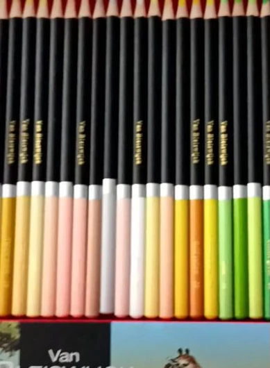
How they feel: smooth application with a firm point
They feel smooth to work with and lay down color easily. In my experience, they feel less soft than Luminance or Prismacolor Premier, but I like that the point retains some firmness. This comparison describes my impressions; it is not a hardness test between brands.
When I need to work on a small detail, I sharpen the pencil again. In the live session, you can see me restore the red pencil’s point from 2:03:58. A fine point helps with hair strokes and the edges of the eyes.
The barrels are triangular with rounded edges. I would use a sharpener with a blade in good condition and avoid forcing the first cut into the wood.
Can you layer and blend these colors?
Yes: in the live session, I layered colors and gradually built their intensity. For me, the key is to begin gently. If I press hard from the first pass, I have less room to adjust a shadow or change the hue.
At the start, I mentioned that their creamy feel made me expect to fill the paper’s tooth sooner than with Polychromos. That does not establish a maximum layer count: several light passes behave differently from a few heavy ones.
How I get started, in four steps
- Choose a small palette. I test the colors together before applying them to the drawing.
- Apply a light base. I hold the pencil a little farther back and tilt it to spread the color without pressing hard.
- Build the shadows. I add more passes and observe how the color changes when another shade is layered over it.
- Leave the finishing touches until last. I strengthen only the areas that need more intensity and sharpen the point again for details.
Join me as I apply color from 24:28. To practice each step at your own pace, find more help in my colored pencil tutorials.
I also noticed differences in intensity between shades; one of the pinks, for example, seemed gentle. It helps to get to know each pencil instead of expecting all 120 to cover in the same way.
The paper I used and what I would look for in another
The live test was done on 190 g/m² Hahnemühle Nostalgie paper. That is the reference for understanding the layers and blends I demonstrate. I did not compare this set on several papers during the same session.
To begin, I would look for drawing paper with a fine texture that picks up color and allows detail. Weight alone does not tell the whole story; the surface also affects how you work.
The paper I tested
Hahnemühle Nostalgie, 190 g/m², the paper I used for this coloring session.
Another option to explore
Canson XL Drawing, 160 g/m², with a light grain. I would consider it for test swatches; I did not test it in this live session.
Before deciding, I would repeat four tests with the same pencils: one light layer, several layers, a two-color blend and a few sharp-point strokes. This helps you see which paper suits the finish you prefer.
I explain what to look for, with more examples, in my guide to choosing paper for colored pencils.
Watch how I used them in the live session
On September 30, 2026, I spent almost three hours on this coloring project. You can follow the process, adjustments and decisions I made to create volume. The recording is in Spanish.
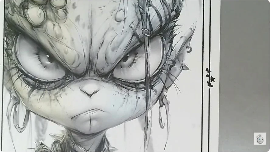
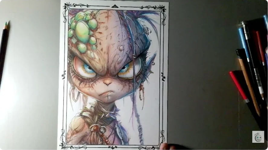
About the final finish: at some points, I used cotton to soften the color. Later, I added a separate white and black pencil, as well as a white marker for the final highlights. Those final highlights therefore do not show what the white pencil in the Van Bleiswijck set can achieve on its own.
Jump to a specific moment in the live session
- 2:12 · The set and my first impressions
- 3:36 · Nostalgie paper
- 8:19 · Layers and the amount of color
- 24:28 · Applying color gently
- 2:03:58 · Sharpening the red pencil again
- 2:05:15 · What happens when that red meets blue
- 2:13:15 · Softening color with cotton
- 2:34:34 · Adding a separate white pencil
- 2:41:03 · Adding a separate black pencil
- 2:45:17 · Highlights with a white marker
Would you like to try them on a drawing?
Choose a page you like, set aside a few colors and make test swatches first. You do not need to try all 120 at once: start with a base shade, a shadow and a light color.
In the catalog, you can choose a coloring page to print. There is also a printable color practice sheet for recording your pencil numbers and trying blends before working on the drawing. The worksheet labels are in English.
You can also find ideas in the Colored Pencil Atlas and adapt a combination by matching its shades. Van Bleiswijck is not yet included in the Atlas: test your pencils on paper to find the closest colors.
Common questions about Van Bleiswijck pencils
Would I recommend them for beginners?
Yes. My experience with this set has been positive and its reference price is accessible. I would begin with a few colors and light passes on drawing paper.
Are they soft or hard?
They feel smooth to apply, with a point that stays reasonably firm. In my experience, they feel less soft than Luminance or Prismacolor Premier.
Can you blend them and build several layers?
Yes. In the live session, I blend by layering and build shadows with more passes. I recommend avoiding heavy pressure at the start to leave room for adjustments.
Is the 120-color set water-soluble?
This review shows a dry test. I have not verified that my set is water-soluble: check the packaging before adding water, because different ranges from the same brand may vary.
Are they wax-based or oil-based? Are they lightfast?
I do not have enough official documentation to confirm the binder composition or a color-by-color lightfastness chart for this set. A creamy feel cannot tell us this. For artwork that will be displayed for a long time, I would look for that information before choosing the pencils.
Where can you buy them, and how much do they cost?
I introduced this set at Action stores for around €13. That is the reference price from my reel, not confirmation of current prices or stock.
Leave a Reply
You must be logged in (Español) to post a comment.