Weight, texture, composition and preservation
Best paper for colored pencils: guide and comparison
Compare 17 drawing papers for colored pencils, from Bristol and drawing paper to Stonehenge, Pastelmat and Arches cotton paper. Learn to choose by texture, layers, weight and surface color, then test your choice with a sample before buying.
The best paper depends on the drawing
Colored pencil paper comparison table
To start, compare fine-grain paper of 160–200 gsm. For detail, try Bristol; for layers, Stonehenge or a vellum finish; for highlights on color, Mi-Teintes or toned paper. Pastelmat offers a different surface worth testing separately.
How this comparison was prepared: it combines Javier Origin’s experience with the five papers in his original selection and manufacturer specifications for the other ranges. Use recommendations are guidelines; the added papers are not presented as personally tested. There are no scores or universal winner.
On mobile, scroll the table sideways. Select a paper’s name to view its features and points to check.
| Paper | Weight / thickness | Surface | Confirmed fibers | What to compare it for | Before choosing |
|---|---|---|---|---|---|
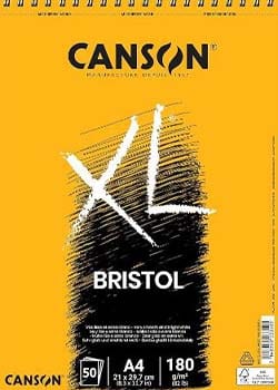
| Canson XL Bristol | 180 gsm | Very smooth | Not specified here | Detail and crisp lines | Check when it stops accepting layers. |
| Strathmore 400 Bristol Vellum | 2-ply¹ | Vellum, light texture | Not specified here | Detail with more tooth than Smooth | Choose Vellum; Smooth is a different finish. |
| Strathmore 400 Drawing Heavyweight | 163 gsm | Medium grain; cream | Not specified here | Practice and visibly textured drawing | Check that it is 163 gsm, not another version. |
| Legion Stonehenge White / Colors | 250 gsm | Soft; subtle grain | 100% cotton | Gentle layers and color blending | Stonehenge Aqua is a different range. |
| BFK Rives / ARCHES Dessin Extra Blanc | 250 sheet / 180 pad | Light fine grain | 100% cotton | White cotton for layered drawing | Buy the fine-art version, not Inkjet. |
| Vélin d’Arches / Dessin Crème | 250 sheet / 200 pad | More pronounced fine grain | 100% cotton | Textured drawing with a warm base | The Crème pad is not Extra Blanc. |
| Magnani Pescia | 300 gsm² | Soft and flexible | 100% cotton | A cotton alternative for coloring | Check the version: Pescia and Editions vary. |
| Fabriano Storia | 180 gsm | Fine grain; natural white | 25% cotton / 75% cellulose | Drawing and layers with moderate texture | It is not equivalent to 100% cotton paper. |
| Hahnemühle Nostalgie | 190 gsm | Fine grain; natural white | Not specified here | Defined strokes and dry drawing | Compare its grain with smooth Bristol. |
| Fabriano Accademia | 200 gsm | Natural grain | Cellulose | Learning and repeated exercises | Other weights are also available. |
| Canson XL Drawing | 160 gsm | Light grain | Not specified here | Regular pencil practice | Less rigid than thick surfaces. |
| Canson Mi-Teintes | 160 gsm | Two sides: fine and honeycomb | Contains cotton | Coloring on a colored base | Try the fine-grain side first. |
| Clairefontaine Pastelmat | 360 gsm | Special grippy surface | Plant fibers / cellulose | Color layers and toned surfaces | It feels different; test before a finished piece. |
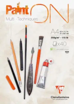
| Clairefontaine PaintOn White | 250 gsm | Very light grain | Cellulose | Color with ink or a light wet base | Naturel and à Grain versions are different. |
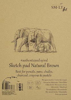
| SM-LT brown Sketch Pad | 135 gsm | Texture of the brown surface | Not specified here | Highlights and shadows on a warm tone | Favor gentle layers and avoid heavy pressure. |
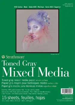
| Strathmore 400 Toned Gray Mixed Media | 300 gsm | Vellum; medium gray | Not specified here | Building highlights and shadows | Do not confuse it with lighter Toned Sketch. |
| Canson Mi-Teintes Velvet | 430 gsm | Grippy velvety surface | Not specified here | Opaque color on dark backgrounds | It is not the 160 gsm Mi-Teintes. |
All paper weights in the table are expressed in grams per square meter (gsm). ¹ 2-ply means two sheets of drawing paper bonded together; Strathmore’s catalog expresses Bristol 400 thickness this way, and we have not converted it to an assumed paper weight. ² Pescia 300 refers to the sheet version in Legion’s catalog; confirm the weight of the product available in your shop. “Not specified here” means the composition was not confirmed for that version, not that it contains no cotton.
Paper is part of the technique too
Why does paper matter so much?
Paper determines how much pigment it can hold, how colors blend and the level of detail you can achieve.
A weak surface can become marked or damaged with repeated work. Smooth paper favors detail, although some finishes accept fewer layers; very pronounced grain can hinder small details. Pencil pressure matters too: changing paper alone does not solve every problem.
- Controls the number of available layers.
- Affects blending and burnishing.
- Defines line and texture sharpness.
- Influences the illustration’s stability and preservation.
Choose for the result you want
Which paper should you choose? Six starting points
Narrow the list to two candidates with the finish you need. Then complete the comparison exercise at the end of this guide.
Drawing or Accademia
Compare Canson XL Drawing 160, Strathmore Drawing 163 and Fabriano Accademia 200. Look for a pad you can use often and a texture that does not distract from the exercise.
How to compare costsBristol Smooth or Vellum
Canson XL Bristol offers a very smooth finish. If you need more tooth, compare Strathmore Bristol Vellum. Choose using a test of eyelashes, hair and small edges.
Differences between finishesStonehenge and cotton drawing papers
Compare Stonehenge, BFK Rives and Pescia with light layers. Their composition does not guarantee a layer count: texture, pencil and pressure also matter.
View cotton optionsMi-Teintes or Toned Gray
Mi-Teintes 160 lets you compare two sides. Strathmore Toned Gray Mixed Media 300 offers a thicker gray base. Make a white and light-color sample before drawing.
Choose the paper sidePastelmat or Mi-Teintes Velvet
These are special surfaces for experimenting with layers and color on toned backgrounds. They do not feel like conventional drawing paper: test detail and blending on a sample.
Explore PastelmatCompatibility before paper weight
160–200 gsm can be a starting point if your printer supports it. Check thickness, size, paper type and feed path; test one sheet. Pastelmat and Velvet are not home-printing papers.
Printing questionsRead the label before buying
Four essential features
The product name is not enough. Check technical specifications to anticipate how the surface will behave.
Paper weight
This is weight per square meter, not a direct measure of thickness. Within a range, a higher weight usually gives more body; across different ranges, it is not enough to compare strength or layer capacity.
Texture
A smooth texture favors detail. Light grain holds more pigment and supports several layers.
Composition
Check whether it contains cotton, cellulose or a blend, and in what proportion. Quality cellulose paper can work very well for coloring; “100% cotton” alone does not describe texture or sizing.
pH and acids
For lasting artwork, look for acid-free paper with neutral pH or an archival-quality specification.
The combination matters more than one specification
A 300 gsm paper may be too smooth for many layers, while a lighter paper with a good texture may hold pigment better.
- Compare weight and texture together.
- Check whether it tolerates erasing and pressure.
- Check printing suitability.
- Assess preservation for the intended use.
Art paper finish glossary
How each surface behaves
Names may vary between manufacturers. Use this guide to interpret a finish before testing it.
Bristol Smooth
Very smooth and precise. Suitable for fine detail, but with less room to build many layers.
Bristol Vellum
A light texture improves grip without sacrificing too much definition.
Velvet
A velvety, grippy surface useful for soft blends, pastels and opaque pencils.
Mi-Teintes
Colored paper that may offer two sides: one smoother and one with pronounced texture.
Pastelmat
It has a specific grippy surface, different from Bristol and sanded paper. The manufacturer includes colored pencils among its uses; compare its response to gentle layers and fine lines.
Hot Press and Cold Press
Hot-pressed paper is usually smoother. Cold-pressed paper retains a more noticeable texture.
Before changing your pencils
Is the problem the paper or the pressure?
If a mixture does not work, make a separate sample. Surface, pressure and layer order can cause similar difficulties.
It will not accept another layer
Repeat the gradient with less pressure. If it still fills quickly, compare fine-textured or vellum paper. Higher paper weight alone does not guarantee more layers.
Two colors are hard to join
Try light layers and a bridging tone before using a blender. Then compare the same exercise on another surface to separate the technique’s effect from the paper’s.
The surface deteriorates
Reduce pressure, erasing and liquid. For mixed media, check that the paper supports your chosen product and test before working on the illustration.
The color looks dull
Observe the surface tone and neighboring colors. On gray, brown or black paper, test a light pencil with good opacity. Contrast also changes color appearance.
Understand simultaneous contrastPapers tested by Javier Origin
Five options with different behavior
These five surfaces belong to Javier Origin’s previously published personal selection. Sizes and sheet counts refer to the pads shown and may vary in other formats.
 Detail
Canson XL Bristol
An extra-smooth surface for fine details, precise drawing and exercises that do not need many layers.
- 50 sheets.
- A pad from the personal selection for practice.
- Check saturation before burnishing.
 Mixed media
Clairefontaine Paint On
A sturdy surface for pencils and mixed media, suitable when you need more strength than light drawing paper.
- 40 sheets.
- Good body.
- May exceed some printers’ limits.
 Colored paper
SM-LT Sketch Pad
Its brown base lets you study highlights and shadows with light and dark pencils. It is an option from the original personal selection for practicing on a warm tone.
- 80 sheets.
- Affordable for sketches.
- Ideal for white, cream and earth tones.
Heavyweight
Strathmore 400 Toned Gray
A soft, grippy vellum surface with a gray base that helps build highlights and shadows.
- 15 sheets.
- Acid-free.
- Its thickness may prevent home printing.
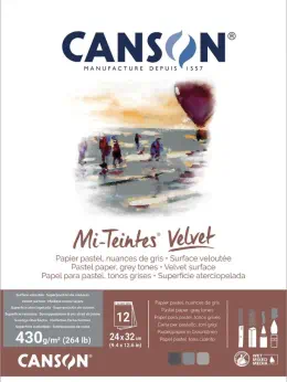 Black paper
Canson Mi-Teintes Velvet
A very grippy velvety surface for opaque colors, pastels and luminous effects on black.
- 12 sheets.
- Very thick.
- Compare pencil consumption on a sample.
Javier Origin’s personal preferences
Which papers I would choose for three different uses
These are my preferences for three different projects. Use them as a starting point and test the result with your own pencils.
For its color, vellum finish and ability to build highlights and shadows.
The 160 gsm version offers color and two sides with different textures.
Its smooth surface favors precise lines and small finishing touches.
More papers for coloring
Stonehenge, Pastelmat, Arches, Magnani, Strathmore and Fabriano
These ranges expand the possibilities of drawing paper. Their features come from manufacturer documentation or Magnani’s distributor; the links let you check the exact version.
Legion Stonehenge
Legion presents this range for colored pencils, with a soft, flexible surface, neutral pH and no acids. White provides a white base; Colors lets you work from neutral tones.
What to compare: gradients and gentle layers. Check the specific white and grain. Do not confuse Stonehenge with Stonehenge Aqua, made for another technique.
Stonehenge White specificationsClairefontaine Pastelmat
The manufacturer offers it for pastel and colored pencils, in white and colors. Its plant-fiber surface holds material differently from traditional grain; it is not simply thicker Bristol.
What to compare: layers on a background tone. Also test a fine line and pigment lifting. Learn its response before transferring a complete illustration.
Pastelmat featuresBFK Rives / ARCHES Dessin Extra Blanc
Arches connects these names within the same drawing family. It is 100% cotton with light fine grain and light sizing. The BFK Rives 250 sheet and Dessin Extra Blanc 180 pad are different products.
What to compare: dry drawing on white cotton. Check format and weight before buying; BFK Rives Inkjet versions for digital printing are not this product.
Arches BFK Rives rangeVélin d’Arches / ARCHES Dessin Crème
Arches describes it as 100% cotton, with more pronounced fine grain and light sizing. The Dessin Crème 200 pad is cream-colored; Vélin sheets are available in other tones and weights.
What to compare: drawings where texture and a warm base contribute to the result. Its finish and format differ from Dessin Extra Blanc.
Vélin d’Arches rangeMagnani Pescia
Legion, Magnani’s distributor, describes Pescia as a soft, flexible, lightly sized Italian paper also suitable for colored pencils. Its origins in printmaking do not prevent its use for drawing.
What to compare: mixtures and strokes on cotton. Legion’s catalog lists 300 gsm sheets; check the weight and name in the shop, because “Pescia Editions” may refer to another format.
Pescia specifications at LegionStrathmore 400 Bristol Vellum
Strathmore’s catalog distinguishes Vellum for pencil from the smoother Smooth finish. Series 400 lists two bonded sheets as its thickness rather than a paper weight.
What to compare: precision and grip. Confirm the series and finish: Bristol 300 and Bristol 400 are different products.
Strathmore catalog (PDF)Strathmore 400 Drawing Heavyweight
This Drawing version is 163 gsm with medium texture. Do not confuse it with lighter Drawing papers or the Colored Pencil range.
What to compare: color exercises and visible texture. Test small details before choosing it for a portrait.
Strathmore catalog (PDF)Fabriano Storia
Fabriano specifies natural white, soft fine grain and no optical brighteners. It includes colored pencils among the uses and declares permanence compliant with ISO 9706.
What to compare: a fine-grain surface with blended fibers. Do not confuse it with pure cotton; decide using a layering and detail sample.
Fabriano Storia specificationsHahnemühle Nostalgie
The manufacturer describes it as fine-grain paper for dry and wet techniques, acid-free and resistant to aging. It is an alternative for comparing defined drawing without starting from completely smooth Bristol.
What to compare: fine lines, gradients and gentle erasing. Check its surface with your pencils; weight alone does not indicate how much pigment it will accept.
Hahnemühle Nostalgie specificationsFabriano Accademia
Fabriano makes it from cellulose, without acids or lignin, with internal and surface sizing. It lists colored pencils among its uses; the range includes several weights, so confirm the version on the cover.
What to compare: a practice pad with natural grain. Calculate cost per usable area without assuming all Accademia papers have the same weight.
Fabriano Accademia specificationsCanson XL Drawing
Canson describes a light-grain paper for pencil drawing and other dry techniques. Its surface differs from XL Bristol: sharing the XL range does not mean sharing the same texture.
What to compare: daily exercises and gentle layers. If printing a coloring page, check your printer’s limits first.
Canson XL Drawing specificationsCanson Mi-Teintes
Canson distinguishes a honeycomb-textured side from a fine-grain side. It contains cotton and comes in many colors. It is a different range from Mi-Teintes Velvet 430.
What to compare: use the fine side for small details first, then the other for a textured effect. The toned base changes the palette’s appearance.
Canson Mi-Teintes specificationsThe first ones I tried were Canson Imagine and Paint On, and it was a complete change.
@soirolaba_scrap says they later found a surface they particularly liked in Hahnemühle Nostalgie. This is a personal community experience, not a comparative test of every range.
Buy the correct product
Arches Drawing, BFK Rives and Vélin: how to tell them apart
“Arches Drawing” may appear as a shop’s drawing-paper description. Check the full name and weight on the cover before treating it as equivalent to another paper.
Dessin Extra Blanc
A 180 gsm pad from the BFK Rives family. The table groups it with BFK rather than counting it as a separate range.
Dessin Crème
A 200 gsm pad from the Vélin d’Arches family. Its cream base and grain distinguish it from Extra Blanc.
Arches Aquarelle and Inkjet
These are products for other techniques. Do not buy watercolor or digital-printing versions assuming they have the same finish as drawing paper.
Buy for your project
How to choose paper without overspending
Start with samples or a small pad. Compare size, sheet count and cost per usable area: a large sheet and A4 do not cost the same per drawing. You do not need every paper in the table.
An affordable, consistent surface
Compare Canson XL Drawing 160, Strathmore Drawing 163 or Fabriano Accademia 200 with your current paper. Choose a consistent finish so you can improve technique without changing surfaces every session.
Buy to solve a specific difficulty
For detail, compare Bristol and Nostalgie. For more layers or highlights on color, try vellum or a toned surface. Repeat the same exercise before buying a large pad.
Check fibers and acids too
Check preservation specifications and supported techniques. The paper label and pencils’ lightfastness matter; a high price alone does not guarantee the result.
Make a repeatable comparison
How to test paper for colored pencils, step by step
The aim is to choose a surface that accepts your layers, preserves detail and tolerates the corrections you need. No layer count applies to every paper.
Identify the surface and draw lines
Note the range, weight, color and side used. With a sharp tip, draw several hair or eyelash lines and a small edge. Keep size and pressure similar on both scraps.
Check: whether grain interrupts the lines or reduces definition.
Add six light layers
Mark six squares around 2 cm wide. Give one a single layer, another two, and continue to six using the same medium pencil with light pressure. Stop if the surface deteriorates; six is a comparison exercise, not its maximum capacity.
Check: whether each layer still changes the tone or the tip starts sliding without adding color.
Make a gradient and test white
Blend the light and dark shades in a separate rectangle, alternating gentle layers. On toned paper, add a white-pencil sample if you have one. Keep the same sequence on both papers.
Check: gradient continuity, visible grain and the background’s influence on color.
Test a correction and the final finish
Gently lift part of a layer with the eraser without repeated rubbing. In another small area, increase pressure a little to see the finish; burnish only if it is part of your technique, at the end of the exercise.
Check: lifted fibers, marks and whether you can color again. Do not expect always to recover the initial white.
Record and choose for your drawing
Record “detail,” “layers,” “blending” and “correction” as sufficient or insufficient for your project, alongside the pencil brand. Choose the sample that meets your priority, then test a fragment of the actual drawing.
Final result: an identified combination of paper, side and pencils that you can repeat. If neither works, change only one variable: start with pressure or texture.
Frequently asked questions
Questions about choosing coloring paper
What paper weight is best for colored pencils?
160–200 gsm is a starting point for comparing dry drawing papers, not a quality standard. Texture, fibers, sizing, pencil and pressure affect the result. Stonehenge 250, Pastelmat 360 and Bristol can behave very differently.
Is Bristol Smooth or Bristol Vellum better for coloring?
Smooth favors a very smooth surface and precise lines. Vellum adds texture to hold pigment. Try both if you need detail and layers; do not decide by weight or assume all brands have the same finish.
Can you use colored pencils on Pastelmat?
Yes: the manufacturer lists them among its uses. The grippy surface changes how color is deposited and blended. Make a layering and detail sample before a full piece.
Do I need different paper for Polychromos, Prismacolor Premier or Luminance?
No paper is mandatory for a particular brand. First compare two surfaces with the same pencils, then repeat with another brand if you wish. Changing paper and pencils together makes it impossible to know what improved the result.
Can I print coloring pages on these papers?
Only if the printer supports the size, thickness and surface type. Check its manual and recommended feed method. Test one compatible sheet: weight alone does not guarantee feeding or proper ink adhesion. Specially coated surfaces require an explicit compatibility statement.
Does watercolor paper work for colored pencils?
It can if its finish suits the drawing. A smooth surface usually helps with detail; pronounced texture remains visible in strokes. Do not confuse it with cotton printmaking paper, and check water compatibility if adding a wet base.
What does gray, brown or black paper contribute?
It provides a base that participates in the palette. Gray and brown let you build highlights and shadows from a mid-tone; on black, check how well light colors cover. Also observe contrast with neighboring colors and test white before starting.
Does acid-free paper guarantee that the drawing will not change?
No. It helps preserve the surface, but pencil lightfastness, lighting, humidity and mounting also matter. Check archival specifications when preserving a work; thick or expensive paper does not replace that check.
Keep learning
Related resources
Blending
See how layers, pressure and grain affect blending.
View tutorialRecommended materials
Review the pencils, papers and accessories used by Javier Origin.
View materials (in Spanish)Pencil Atlas
Organize your colors and prepare a palette before testing paper.
Open the Atlas (in Spanish)Coloring pages
Print a simple page and compare the result on several surfaces.
Choose a drawingVerifiable information
Documentation and scope of the guide
Each range links to its specifications. For papers in the original selection, you can also consult Canson XL Bristol, Clairefontaine PaintOn and Mi-Teintes Velvet. The illustrated sheet counts and formats come from Javier Origin’s original selection.
Weights and formats were checked against the specifications for Stonehenge Colors, Pastelmat 360 and the 2021 Legion catalog for Pescia 300 (PDF). For Strathmore, the source is its catalog hosted by Sitaram in 2022 (PDF); confirm the current product on the cover before buying.
Conclusions about what to try first are recommendations from this guide. They are not laboratory testing or personal tests of all 17 ranges. No fixed prices are included: they vary by shop, size and format.
The label guides you; the test decides
Compare the same gradient on two papers
Use the same pencils, pressure and layer count to discover which surface suits your way of working.
Leave a Reply
You must be logged in (Español) to post a comment.