2,016 combinations · 6 brands · 12 themes
Colored pencil palettes by theme, brand and artistic role
Find pencil combinations for portraits, hair, animals, flowers, nature, fantasy and characters. Explore Javier Origin’s curated selections and open each one in the Atlas to check exact colors, adapt substitutions and work with the pencils you already own.
Explore what you want to color
Colored pencil palettes by theme
Start with your drawing’s subject. Curated themes bring together combinations for skin, hair, animals, botanicals, landscapes, atmospheres and fantasy, with access to the artistic guide or directly to the relevant selection in the Atlas.
- Palette themeAnimals and furOpen in the AtlasView theme guide (Español)
- Palette themeDark and dramaticOpen in the AtlasView theme guide (Español)
- Palette themeEmotions and atmospheresOpen in the AtlasView theme guide (Español)
- Palette themeFantasy and magicOpen in the AtlasView theme guide (Español)
- Palette themeFire, sun and sunsetOpen in the AtlasView theme guide (Español)
- Palette themeFlowers and botanicalsOpen in the AtlasView theme guide (Español)
- Palette themeHairOpen in the AtlasView theme guide (Español)
- Palette themeNature and forestOpen in the AtlasView theme guide (Español)
- Palette themeSweet and pastelOpen in the AtlasView theme guide (Español)
- Palette themeSkin and portraitOpen in the AtlasView theme guide (Español)
- Palette themeVintage, sepia and antique tonesOpen in the AtlasView theme guide (Español)
- Palette themeWater, sky and iceOpen in the AtlasView theme guide (Español)
Palettes adapted to your pencils
Colored pencil palettes by brand
Each range has a different hardness, coverage and response to paper. Choose your brand for combinations designed around its blending, layering and point retention, and its ability to build light, bases, transitions, accents and shadows. Each link opens the Atlas in palette mode with that range selected.
Faber-Castell Polychromos palettes
Clean, controlled combinations for layers, skin, hair, animals, botanicals and precise details without losing color richness.
View Polychromos palettes in the AtlasPrismacolor Premier palettes
Soft, saturated selections for expressive blends, intense gradients, fantasy, portraits and creamier coloring finishes.
View Prismacolor palettes in the AtlasCaran d’Ache Luminance palettes
Balanced palettes for light, skin, flowers and subtle nuances when you want a luminous appearance and carefully controlled transitions.
View Luminance palettes in the AtlasHolbein Artists palettes
Vivid combinations for characters, anime, fantasy, fashion, flowers and scenes that need clean color, variety and clearly defined accents.
View Holbein palettes in the AtlasDerwent Lightfast palettes
Deep selections for layering, colored shadows, skin, nature, fur and work where value, temperature and permanence matter.
View Lightfast palettes in the AtlasCastle Arts Gold palettes
Practical palettes for making the most of a large collection in portraits, animals, flowers, fantasy and adult coloring with clear visual organization.
View Castle Arts Gold palettes in the AtlasHalloween special · Faber-Castell Polychromos
Six palettes for coloring Halloween
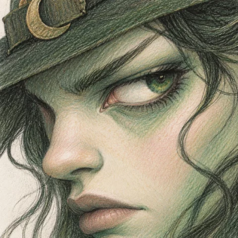
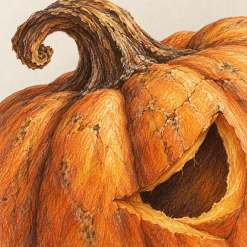
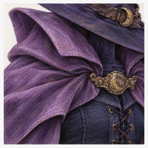
Here are six Halloween ideas with their exact Polychromos colors. Change the image to see each pencil’s name and number.
Witch skin: olive and ivory
- 103 Ivory
- 132 Beige Red
- 189 Cinnamon
- 172 Earth Green
- 175 Dark Sepia
Pumpkin: carved rind
- 102 Cream
- 108 Dark Cadmium Yellow
- 111 Cadmium Orange
- 186 Terracotta
- 176 Van Dyck Brown
Witch outfit: violet and gold
- 160 Manganese Violet
- 136 Purple Violet
- 157 Dark Indigo
- 250 Gold
- 175 Dark Sepia
Potion: turquoise glass
- 154 Light Cobalt Turquoise
- 155 Helio Turquoise
- 137 Blue Violet
- 183 Light Yellow Ochre
- 181 Payne's Grey
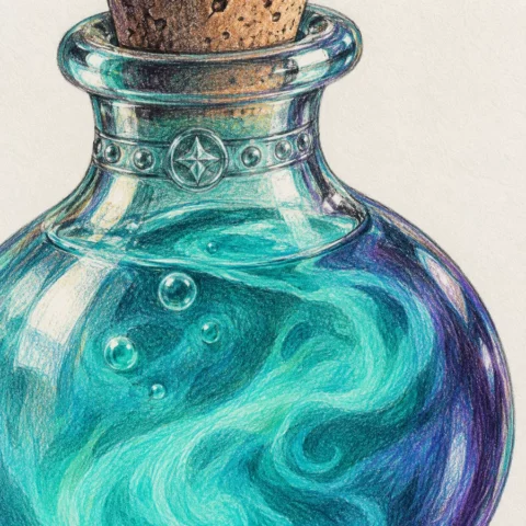
Raven: inky reflections
- 230 Cold Grey I
- 233 Cold Grey IV
- 247 Indanthrene Blue
- 157 Dark Indigo
- 199 Black
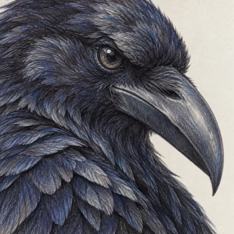
Skull: aged bone
- 103 Ivory
- 270 Warm Grey I
- 272 Warm Grey III
- 274 Warm Grey V
- 175 Dark Sepia
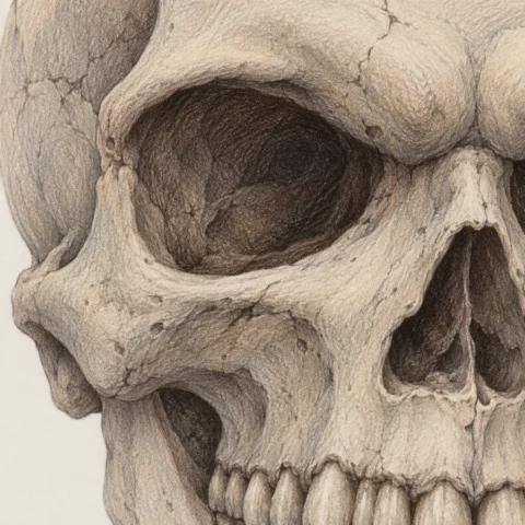
Digital swatches are a guide: the result changes with your screen, paper and pencil pressure.
More than a collection of pretty shades
What is a colored pencil palette?
A palette is a visual structure that organizes a small group of colors to create light, volume, temperature, atmosphere and focus. It acts as a map before coloring and lets you replace a pencil without losing the illustration’s overall logic.
- Light preserves clarity and prevents every part of the drawing from carrying the same weight.
- The base establishes the local color of skin, petals, fur or fabric.
- Transitions connect light and dark areas without abrupt breaks.
- Accents guide the eye toward eyes, flowers, magic or important details.
- Depth strengthens volume without always relying on black pencil.
Build a combination that makes sense
How to choose a colored pencil palette
A combination works better when every color has a role. This system helps you compare brands, find substitutes and adapt any Atlas palette to your own collection.
Preserve the light
Decide which areas will keep the paper visible or receive your lightest pencil. Protecting light from the start avoids having to recover it later with too much pressure.
Choose the base color
The base establishes what you are coloring: skin, petals, fur, fabric, wood, sky or metal. It should be flexible enough to receive both light and dark layers.
Add a transition
The transition shade joins light and shadow. It is especially important for skin, hair, clouds, flowers and soft surfaces where obvious color bands are undesirable.
Include an accent
A small accent can bring life to eyes, lips, flowers, jewelry, reflections or magical effects. It does not need much space to change how the drawing reads.
Define depth
Try a deep brown, blue, violet, green or red before reaching for black. Colored shadows often preserve more of the palette’s richness.
Control temperature
Decide whether the scene will be warm, cool or balanced. Temperature helps separate planes, suggest lighting and give the scene a coherent story.
From combination to practice
How to use palettes in your drawings
The Atlas organizes color; tests on paper turn that information into experience. Use these paths to practice specific goals and connect palettes, materials and technique.
Learn to build layers and transitions
Understand pressure, layer order, blending and volume before using a complete palette on a finished illustration.
Learn to color with colored pencilsPractice with reference images
Analyze light, temperature and materials in selected references to decide which role each pencil should play.
View drawing reference imagesAdapt the palette to your paper and brand
The same selection may behave differently depending on core hardness, paper grain and how many layers the surface accepts.
Compare colored pencil materialsApply palettes to fur, feathers and textures
Practice stroke direction, undertones, broken highlights and colored shadows on subjects with different natural surfaces.
Explore animal coloring pagesCombine skin, hair, eyes and costumes
Create a clear hierarchy so the face remains the focus and secondary colors support the character without competing.
Practice palettes with anime and kawaiiCreate magic, portals and ambient light
Use warm–cool contrasts, saturated accents and glowing edges to create scenes beyond strictly realistic colors.
Explore fantasy coloring pagesThe Javier Origin method
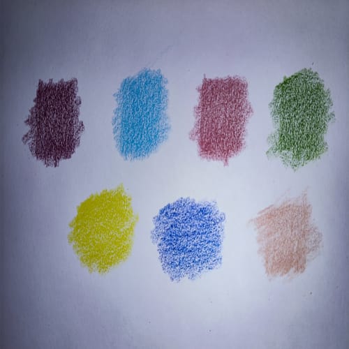
Test the palette before the final drawing
You understand a palette by testing it on the same paper, with the pressure and layers you will use in the illustration. This simple process reveals value gaps and useful substitutions before you commit to the final work.
Frequently asked questions
Palettes, substitutions and using the Atlas
Quick answers for adapting combinations to your materials and avoiding common color-selection problems.
Do I need exactly the same pencils?
No. Preserve value first, then temperature and finally intensity. A good substitute keeps the role of light, base, transition, accent or depth even when the brand changes.
How many colors should a palette include?
Three to six is usually enough for practice. A small selection makes blending easier to control and shows what each pencil contributes. Complex scenes can use more when there is a real need.
How do I choose a skin or portrait palette?
Look for a highlight, base, transition shade, warm variation for blush or flushed areas, and a deep shadow. Avoid darkening all skin with black, and test temperature changes first.
Why does the screen color differ from the real pencil?
A screen emits light; pigment reflects light on paper. Calibration, surface, pressure, layer count and the light under which you view the drawing also affect the result.
Can I use one brand’s palette with another brand’s pencils?
Yes. Compare color families and values, not just commercial names. The Atlas lets you explore families across brands and adapt a combination’s structure to the pencils you own.
How can I tell whether a combination works?
A palette works when volume is clear, transitions avoid unnecessary jumps, light remains visible and the focal point stands out without every color competing at equal strength.

From digital color to a paper test
Turn every combination into a tool for your drawings
Open the Atlas, compare brands, record your pencils and adapt the curated palettes to the materials you already use.