Guided tutorial · colored pencils
How to color a kawaii witch with colored pencils step by step
In this tutorial, you will learn to color a kawaii witch using seven colored pencils. We will create warm light, soft shadows and a Halloween palette with green hair as an accent, following photographs of the process.
Start by marking highlights and shadows across the drawing. Then distribute the base colors, soften the layers with dry cotton and strengthen contrast where needed.
- Beginner and intermediate
- 7 Polychromos pencils
- A4 paper · 150 gsm
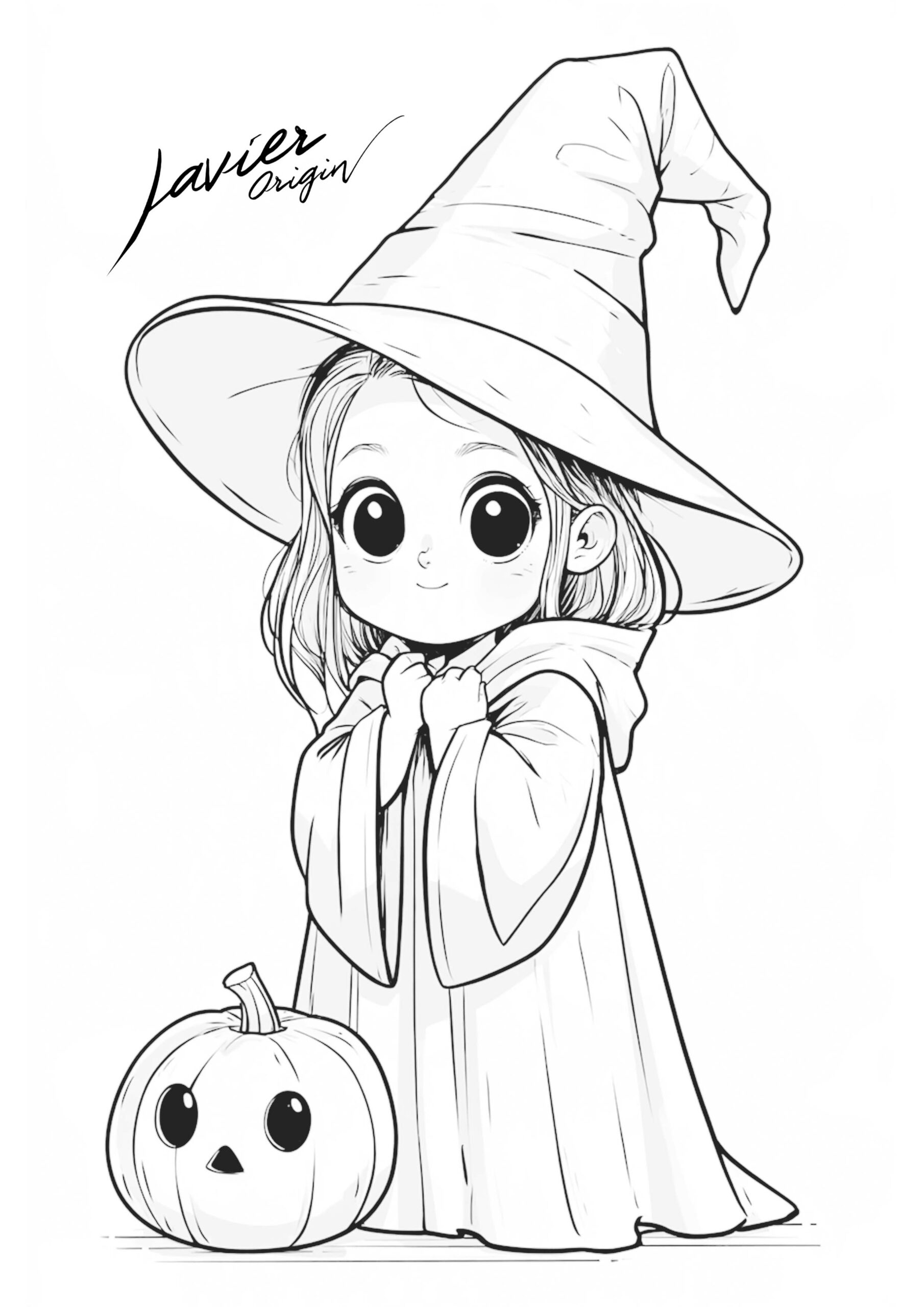
Coloring time for this example: around 30 minutes, excluding mixing tests. Give each layer as much time as you need.
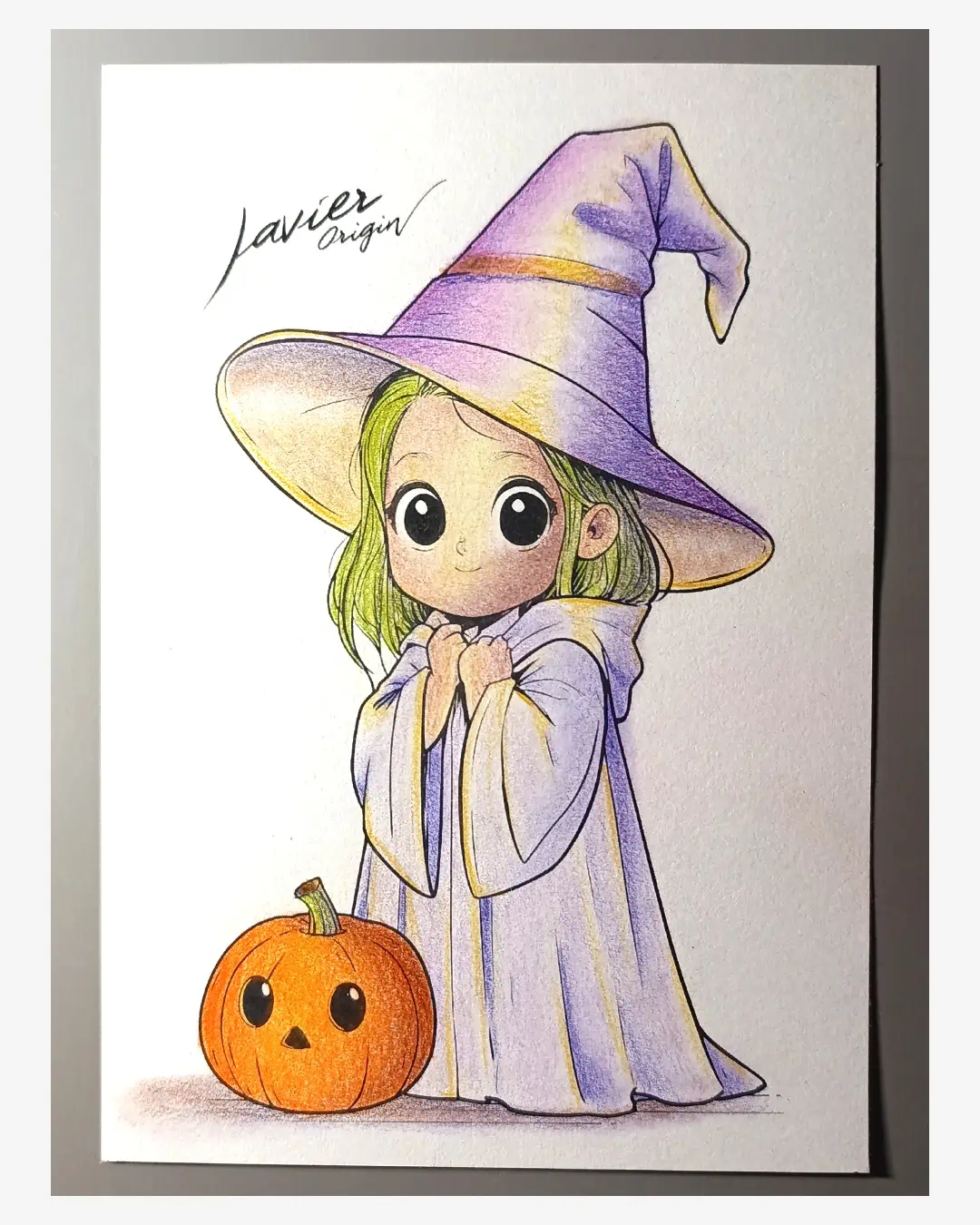
Before you start
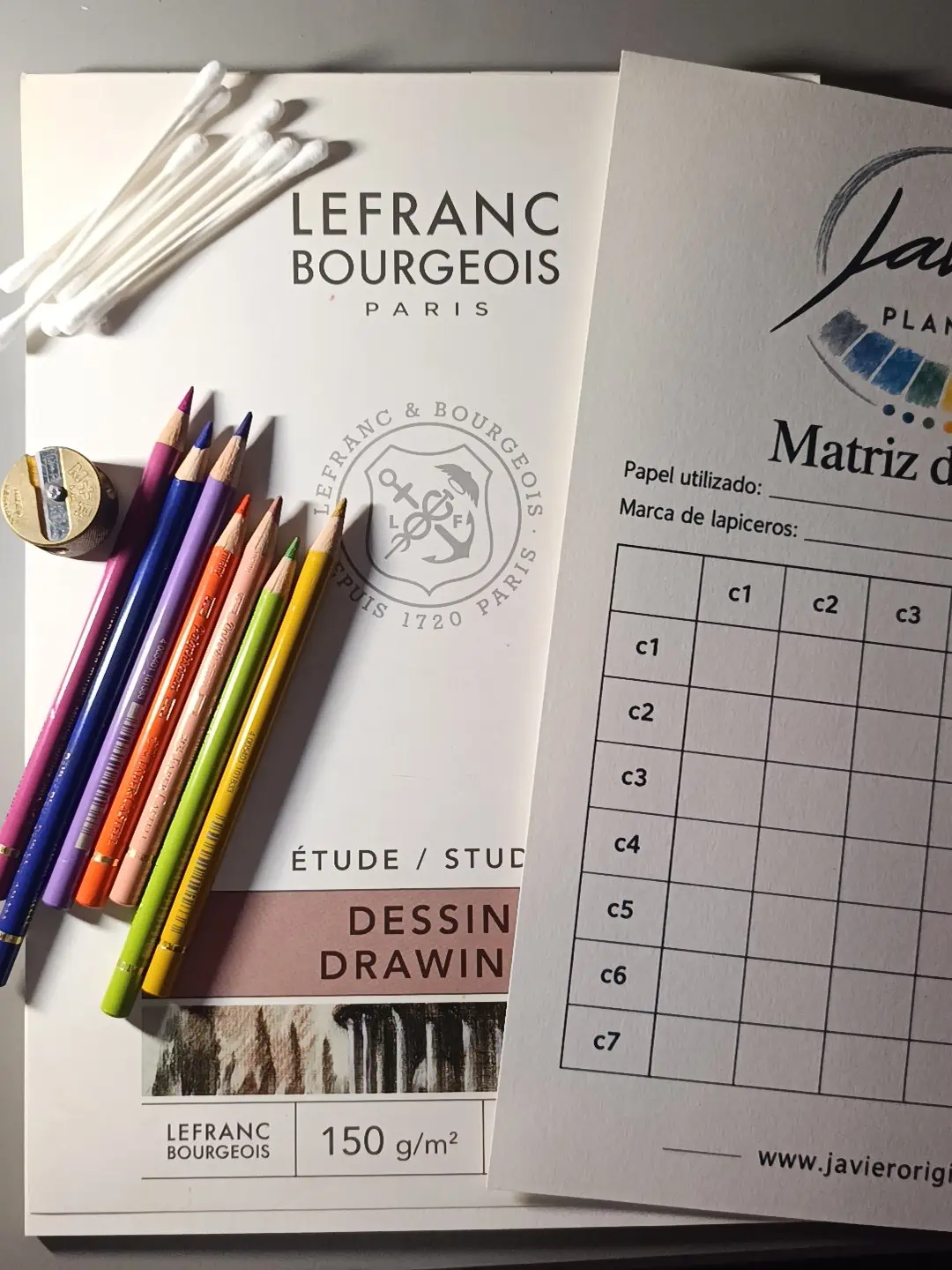
Prepare the paper, pencils and cotton
- Witch template and mixing chart to prepare the drawing and test combinations.
- 150 gsm Lefranc Bourgeois Dessin paper. This is the affordable paper tested in this tutorial: its surface felt smooth and accepted several light layers.
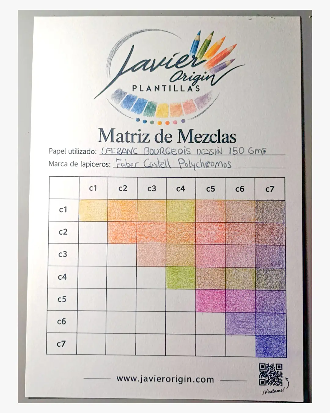
- Seven Faber-Castell Polychromos pencils, with names and numbers in the following table.
- Dry cotton swabs to soften transitions and make the paper grain less visible.
- Pencil sharpener and a kneaded eraser. Keep the eraser nearby in case you need to remove a light smudge outside the outline.
Make samples on the same paper you will color on. This lets you assess the mixtures before applying them to the character. If you are unsure about the surface, see the guide to choosing paper for colored pencils.
The blender in the pencil extender was tested in some chart mixtures; dry cotton was used to blend this character.
A soft Halloween palette
Use these seven colors and give each a role
In this palette, ochre provides warm highlights, and Delft Blue 141 is the blue chosen after testing to shade the skin, clothing and pumpkin. Combine those highlights and shadows with orange, pink and violet, reserving green to make the hair stand out.
If you change colors, pencils or paper, test the mixtures again: the same blue may affect skin or orange differently. Look for a shadow that darkens the base color without hiding it, and apply it with very light pressure first.
| Chart | Color and number | Where to use it |
|---|---|---|
| C1 | Light Yellow Ochre 183 | Warm highlights, hair and the ground-shadow mixture. |
| C2 | Dark Cadmium Orange 115 | Pumpkin base color. |
| C3 | Cinnamon 189 | Skin base color. |
| C4 | May Green 170 | Hair, combined with ochre. |
| C5 | Middle Purple Pink 125 | Hat base color. |
| C6 | Violet 138 | Cape base color and ground-shadow mixture. |
| C7 | Delft Blue 141 | Initial shadows on the character and pumpkin. |
Step 1 · Prepare the drawing
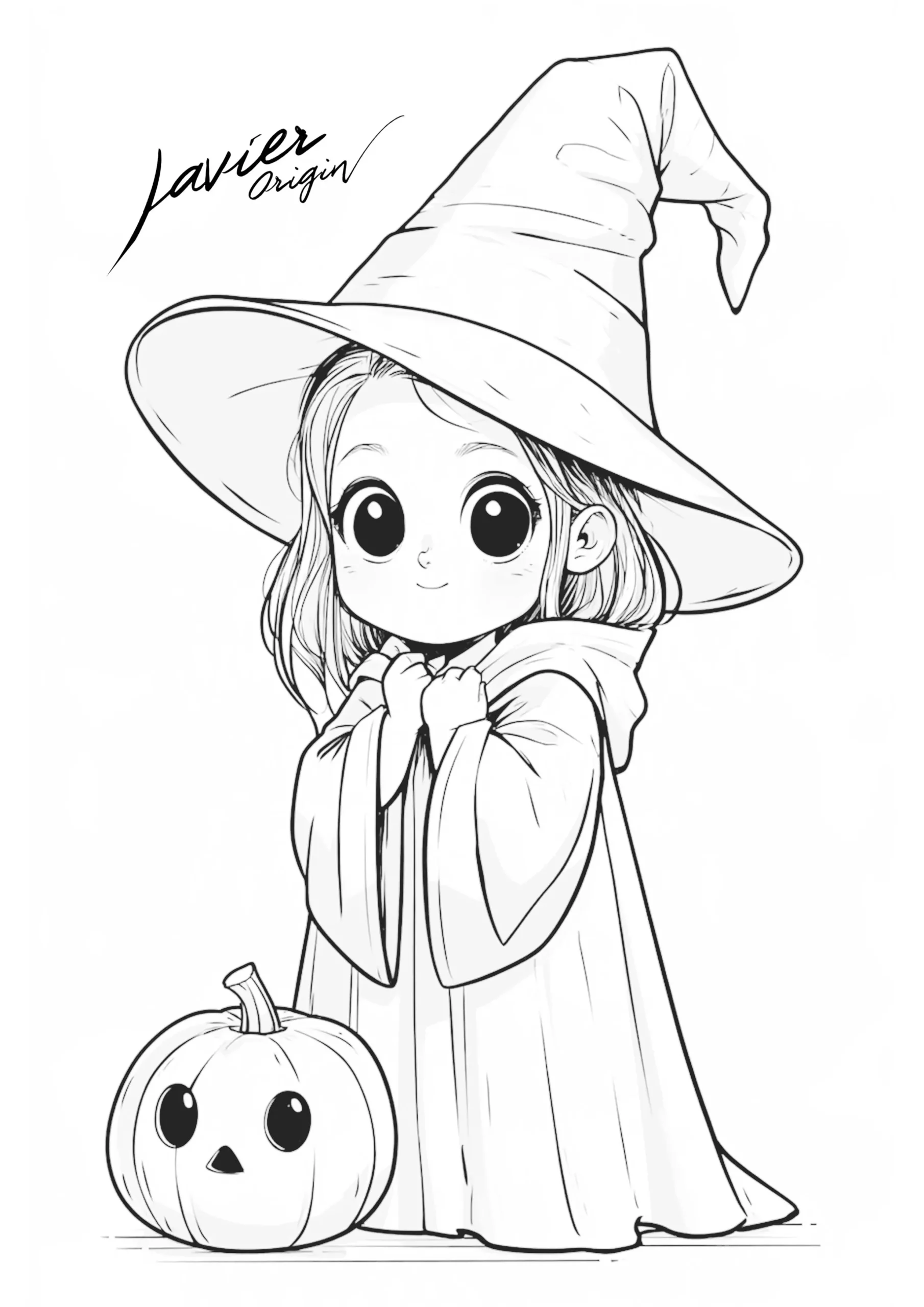
Download the witch and print the template on A4 paper
Prepare a copy of the witch with a cape and pumpkin. Keep another sheet of the same paper for the chart: you will use it to choose mixtures for highlights, shadows and mid-tones.
For reference, the example was printed on A4 paper with an inkjet printer in grayscale or black and white, using the “Plain paper” setting, without advanced adjustments or bidirectional printing. Check your printer’s compatibility with your chosen paper before printing.

Step 2 · Test combinations
Test mixtures before coloring
Assign the table’s colors to C1–C7. Use light pressure to see how the layers overlap.
- Apply the first layer horizontally with the corresponding color.
- Layer the second color vertically using the color that intersects that square.
- Compare the result: observe which mixtures preserve light and which darken without losing the base color.
For example, where C1 meets C2, first apply Light Yellow Ochre 183 horizontally, then Dark Cadmium Orange 115 vertically. The orange sits above the ochre.
You can complete just half the chart, as in the photograph. The other half lets you reverse the order of the same pairs and compare how the mixture changes.
Pay particular attention to combinations with Delft Blue 141: after these tests, it was chosen to shade the skin, clothing and pumpkin.
Video: practice with a mixing chart (in Spanish)
Follow your tests with this livestream about creating a limited Polychromos palette. Prepare your chart and watch the filling process before continuing with the witch.
The video example uses six colors. For this witch, follow the table’s seven-color palette and this tutorial’s instructions. It is a long livestream, around 4 hours and 46 minutes; the witch coloring time stated above refers only to this exercise.
Step 3 · Establish form
Mark shadows and highlights across the drawing
Imagine light arriving from the front left, toward the direction the witch is looking. Keep this reference consistent on the face, arms, hat, cape and pumpkin.
Start with shadows in Delft Blue 141
Apply blue with gentle strokes in the shadow areas. Use the photographs to position them. Move between areas and mark an initial shadow across the whole drawing, without fully darkening any part.
Mark highlights with Light Yellow Ochre 183
Color the areas facing the light with yellow ochre. Apply very little pigment to keep them pale: these initial marks help preserve the lighting when you add base colors.
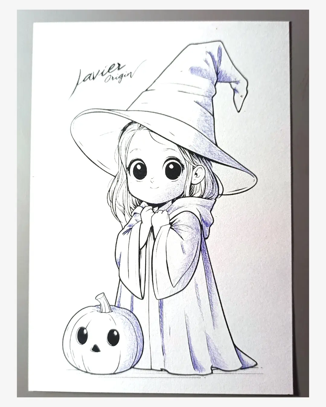
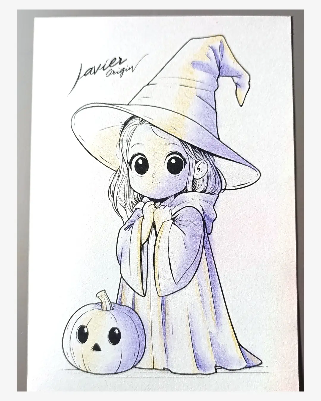
To see how little pigment is in the first layers, open the full-size photographs: first blue shadows (new tab) and ochre highlights and shadows (new tab). Look closely at the face, arms and pumpkin to compare light and dark areas before the base color.
Step 4 · Distribute color
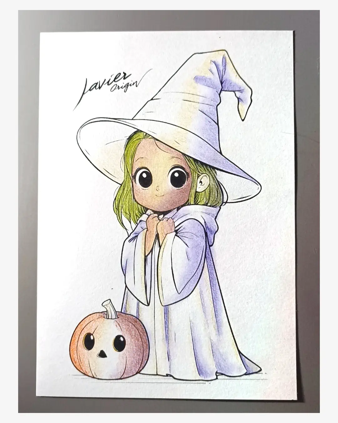
Add base colors in light layers
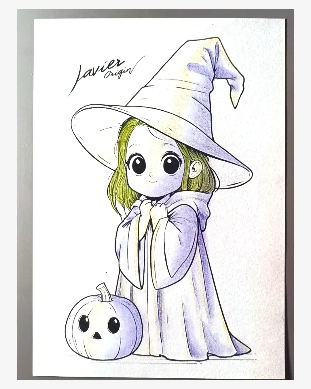
Begin covering each surface with its base color. Work across the entire character and pumpkin without finishing one area before moving to the others. This lets you compare color intensity as the drawing develops. After one or two layers, soften with dry cotton as explained in the next step.
Skin: Cinnamon 189
Color the face, arms and other skin areas with Cinnamon. Keep the underlying ochre highlights and blue shadows visible. Near highlights, reduce the amount of color.
Hair: ochre 183 and May Green 170
Add May Green to the hair and combine it with ochre in the lit areas. Follow the direction of the strands and preserve pale areas to give the green depth.
Hat and cape: pink 125 and violet 138
Use Middle Purple Pink as the hat base and Violet as the cape base. Start with gentle layers on both garments; later, intensify the hat while keeping the cape delicate.
Pumpkin: orange 115
Apply Dark Cadmium Orange as the base color. Keep ochre in the highlights and Delft Blue in the shadows. Apply less orange near lit areas to preserve the difference between light and dark.
Step 5 · Soften transitions
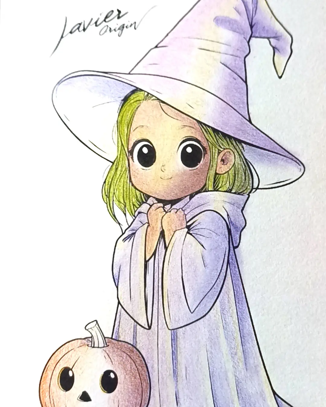
Create gradients and blend with dry cotton
In each area, apply more color toward shadowed edges and less near highlights. Build this difference with light layers instead of pressing hard to darken all at once.
Then use a completely dry cotton swab, rubbing gently in the direction of the form: follow the flow of the hair and the surfaces you are coloring.
Use cotton after every one or two layers, depending on how visible the paper grain is. If it is very noticeable after the first layer, soften it before continuing. If the layer already looks even, add another and blend afterward.
Aim for smoother color transitions and a more even visual texture. Cotton helps spread surface pigment; it does not physically remove the paper’s grain.
Step 6 · Compare the whole
Strengthen shadows and keep the cape softer
Look at the whole witch again. Using the colors already applied to each area, add another light layer where shadows need more separation from the highlights. Work gradually and compare before darkening further.
To approach the example’s finish, intensify the hat and keep the cape softly colored. This concentrates color in the upper area while preserving the character’s delicate appearance.
Check the skin and pumpkin too. Strengthen only what is needed to clarify their forms and keep the highlights visible.
Step 7 · Ground the figure
Add the ground shadow and review the finish
Gently apply Light Yellow Ochre 183 and Violet 138 beneath the character and pumpkin. Use dry cotton to mix and soften the patch, leaving a gentle transition into the paper.
This shadow helps both figures look grounded. Keep it light so it supports the drawing without dominating it.
Before calling it finished, check these three things:
- The light reads clearly: lit areas remain lighter than shadows.
- The color is balanced: green hair stands out, and the cape remains softer than the hat.
- The character is grounded: the shadow visually connects the witch and pumpkin to the ground.
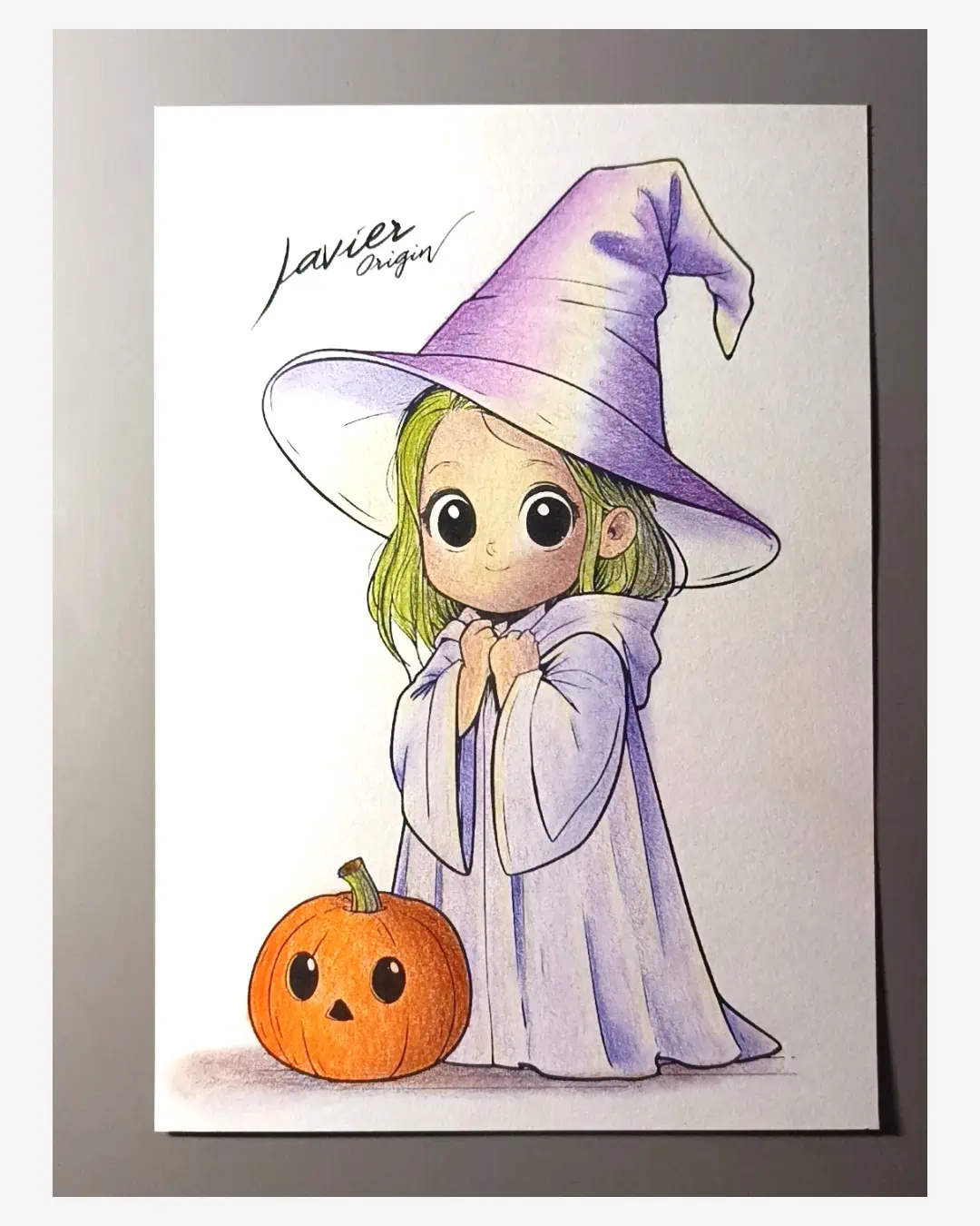
Compare your drawing with the finished result
Observe the warm light, green hair accent and difference in intensity between hat and cape. If those relationships are clear in your drawing, you can call it finished even with a soft texture and some visible paper grain.
Try what you learned on another page
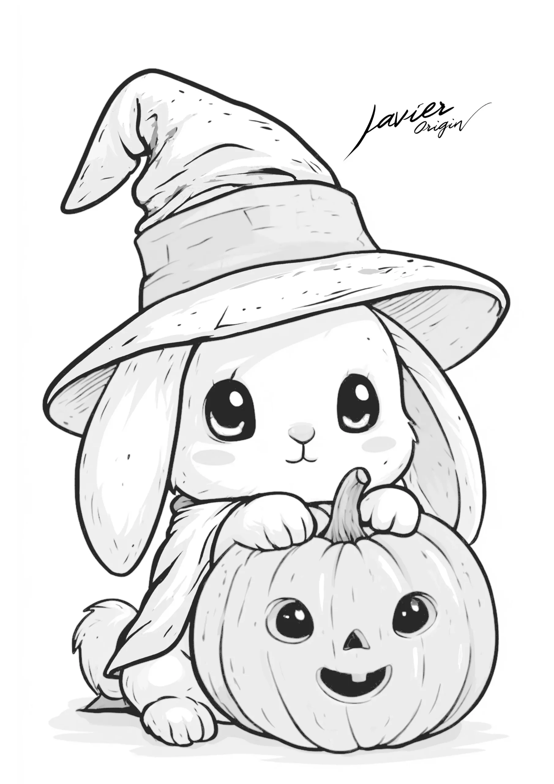
Take your palette to the bunny with a witch hat
After finishing the witch, try a second exercise: a kawaii bunny with a witch hat and pumpkin. Keep the pencils already on your table and change how you distribute the colors.
Try pink and violet on the hat, orange on the pumpkin and a small green accent on the ribbon. Leave some paper uncovered in the fur, and test shadows separately before applying them to the face.
Do not copy the witch’s shadow positions: observe how the hat, ears and pumpkin overlap. Decide where the light comes from and use the chart to choose mixtures for this new scene.
Another option for trying oranges and violets is the kawaii cat with a Halloween pumpkin.
If you have questions
Questions about this coloring exercise
Why mark highlights and shadows before the base color?
To establish a lighting reference from the start. Distributing them across the drawing lets you compare form and contrast between areas before intensifying the colors.
Why spread color across the drawing without finishing one area?
To compare parts while you can still adjust layers. Distribute highlights, shadows and bases first, then decide where you need stronger contrast or color. This keeps the cape soft and gives the hat more presence without losing sight of the whole.
What if the first layer looks very pale or grainy?
A pale first layer is the starting point for this exercise. Add color gradually and gently use dry cotton when you need to even the surface, as explained in the blending step. You do not need to hide all the white paper in one pass.
Can you follow the tutorial with other pencils?
Adapt the palette by finding similar shades. Make the chart on your paper first: the numbers identify the Polychromos used here and do not automatically correspond to another brand.
Do you need to dampen the cotton or use a blender?
Use dry cotton for this exercise. A blender was tested on some chart samples, but the character was blended with cotton. You do not need that pencil to follow these steps.
What if cotton smudges outside the outline?
For a light surface-pigment smudge, try lifting it carefully with a kneaded eraser for a gentler correction. A precision or electric eraser is another option, avoiding repeated rubbing that damages the paper. How easily it erases depends on the pigment and how firmly it has set. This is a possible correction; it was not needed in this example.
Continue with Halloween
Halloween Stamps: more drawings for your next tests
If you enjoyed coloring this witch, continue with Halloween Stamps. Choose another illustration from the collection and practice what you have learned: test mixtures, position highlights and shadows, and build color with gentle layers.
For a different theme, the catalog also includes Mundos Chibi Ladies for further character and costume practice. Check each book’s samples and price before choosing.
The Halloween Stamps link opens in another tab so you can return to the tutorial.
Leave a Reply
You must be logged in (Español) to post a comment.