Practical tutorial · colored pencils
How to color characters with colored pencils step by step
Learn to color characters with colored pencils step by step: test your palette, prepare the skin, build the hair, shape the clothing and concentrate the final contrast in the eyes and face.

Before starting
The full tutorial strategy
Soft finish
Build an expressive illustration without saturating the paper too early.
From broad shapes to details
Tests, skin, hair, clothing, features and final contrast.
Test sheet
Check pressure, saturation and mixtures before touching the drawing.
Eyes and face
Reserve the cleanest edges and strongest contrast for the face.
Working method
First I decide, then I color
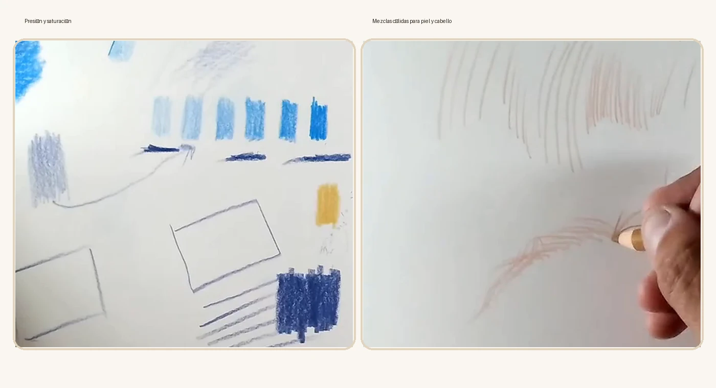
Before working on the character, check how each pencil responds, how much it darkens with layers and which mixture produces the shadow you need. This preparation avoids harsh corrections and keeps the result clean.
 Step 1
Step 1 · Tests
I create a small color chart
I work on a separate sheet. First I make a very gentle sample, then a medium layer and finally a more saturated area. I also test what happens when layering a warm shade over a cool one.
Light pressure
For transparent bases and first layers.
Medium pressure
For building shadows and form.
Strong pressure
Only for accents, edges and final details.
Building the character
From light layers to final contrast
Once you have chosen the palette, work through the areas without finishing one with maximum pressure too early.
 Step 2
Step 2 · Skin
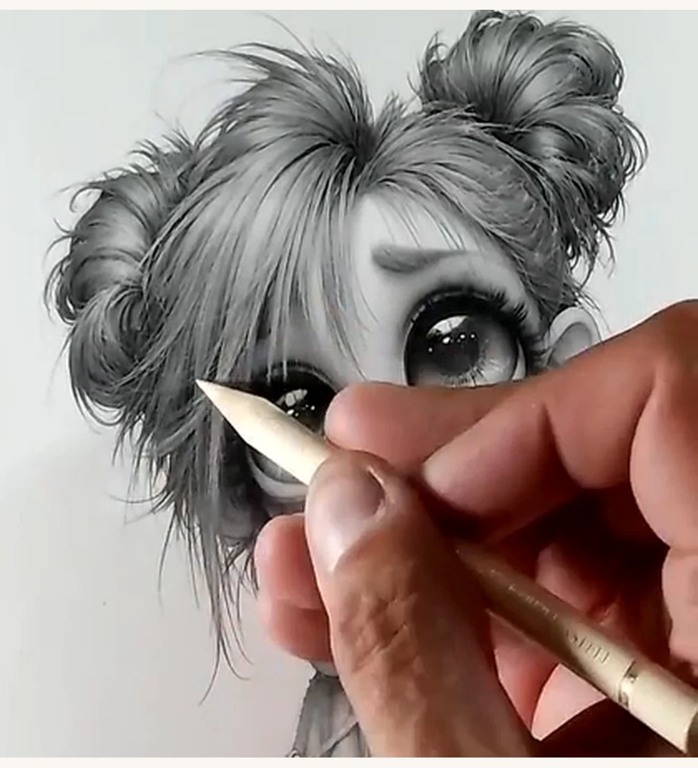
I prepare the skin with a light base
I apply a light, warm tone with very gentle pressure. I keep the facial highlights clean and avoid completely covering the drawing’s shadows.
- Unify the skin without losing the lines.
- Preserve white in the highlights.
- Leave room for blush and later shadows.
Step 3 · Hair
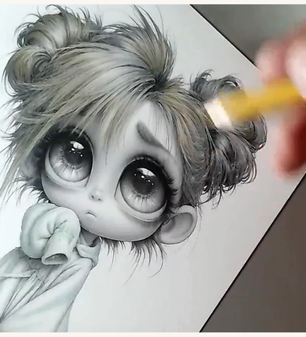
I place a warm base following the hair
I stroke in the direction of the strands. I do not fill the hair as a flat silhouette: each line follows its flow and curve.
- Work from the root toward the tip.
- Change direction when the strand changes.
- Reserve the lit areas from the start.
 Step 3
 Step 4
Step 4 · Form
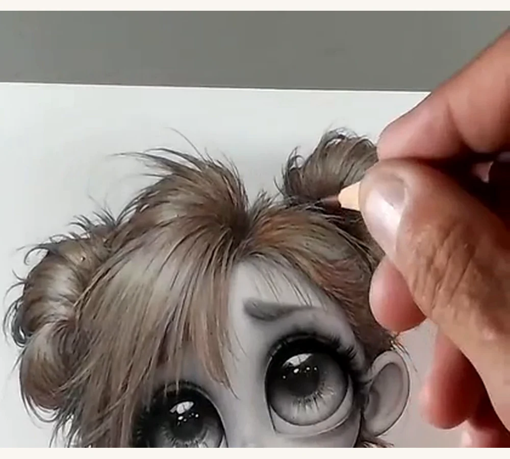
I separate the strands with deep shadows
I add Brown Ochre and Burnt Ochre at roots, crossings and hidden areas. Contrast concentrates where one mass of hair overlaps another.
- Darken roots and overlapping strands.
- Soften the transition toward lit areas.
- Do not draw every hair with the same intensity.
Step 5 · Hoodie
I spread the base color without hiding the folds
Apply a light base layer with the side of the pencil, keeping surfaces facing the light paler. The reference image shows a cool, grayish tone; choose a similar muted color if you want to follow its appearance.
- Use broad strokes and light pressure.
- Respect the structural lines of the folds.
- Avoid turning the whole garment into one value.
 Step 5
 Step 6
Step 6 · Folds
I shape the hoodie with cool shadows
I strengthen the inner sleeves, lower edges and folds with Middle Phthalo Blue and thin layers of Caput Mortuum. Then I soften the transition toward the base tone.
- Connect each shadow to a real fold.
- Alternate hard and soft edges.
- Avoid purely decorative dark lines.
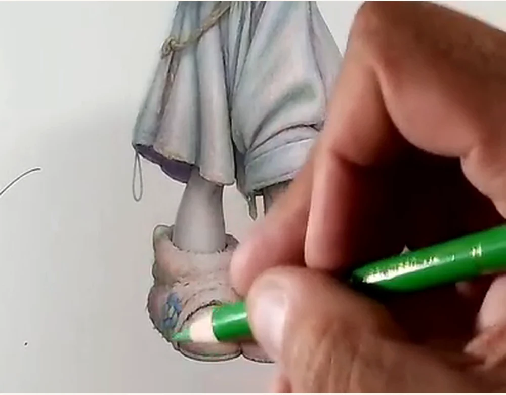
Step 7 · Lower body
I bring the legs and shoes into the same lighting
I use Salmon for skin and Caput Mortuum for shadows and footwear. I darken beneath the hoodie, between the legs and at shoe joints to add weight.
- Repeat the temperature used on the face.
- Add contact shadows where parts meet.
- Keep the shoes subordinate to the focal point.
 Step 7
 Step 8
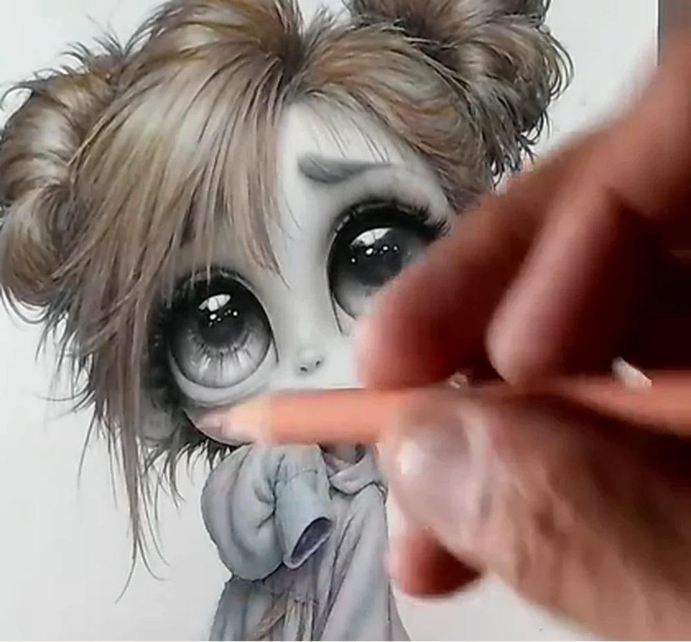
Step 8 · Face
I add blush and warmth to the skin
I gently apply Salmon on the cheeks, nose and face edges. The layer should blend into the base.
- Build pink through transparent layers.
- Soften the edges before increasing pressure.
- Keep the main highlights clean.
Step 9 · Eyes
I concentrate color at the focal point
I add Middle Phthalo Blue while preserving white highlights. I darken the upper iris with several layers of Middle Phthalo Blue and leave the lower area brighter.
- Preserve reflections from the first layer.
- Darken beneath the upper eyelid.
- Soften the gradient without losing definition.
 Step 9
Step 10
Step 9
Step 10
Step 10 · Finish
I balance the whole and clean up the result
I review the character from a distance. I strengthen selected edges, deepen small shadows and check that the face dominates the clothing and shoes.
- Strengthen only the necessary edges.
- Balance warm hair tones with cooler, muted colors in the clothing. Test the suggested pencils on scrap paper before choosing your combination.
- Check that no area competes with the eyes.
Faber-Castell Polychromos
Character palette
This selection of six Polychromos pencils builds skin, hair, clothing, deep shadows and the eyes’ focal color without using a whole box.
Burnt Ochre
Warm hair shadows, roots and deep transitions over Brown Ochre.
Brown Ochre
Main hair base and bridging shade for building gold and brown strands.
Caput Mortuum
Deep shadows, footwear, contact areas and small warm contrast accents.
Salmon
Skin base and blush, cheeks, nose and warm facial transitions.
Leaf Green
Hoodie base color and clothing mid-tones.
Middle Phthalo Blue
Cool hoodie shadows, eyes and small accents that draw attention to the face.
Close-ups of the result
Key finishing details
The close-ups show where the most important transitions and contrasts are concentrated.
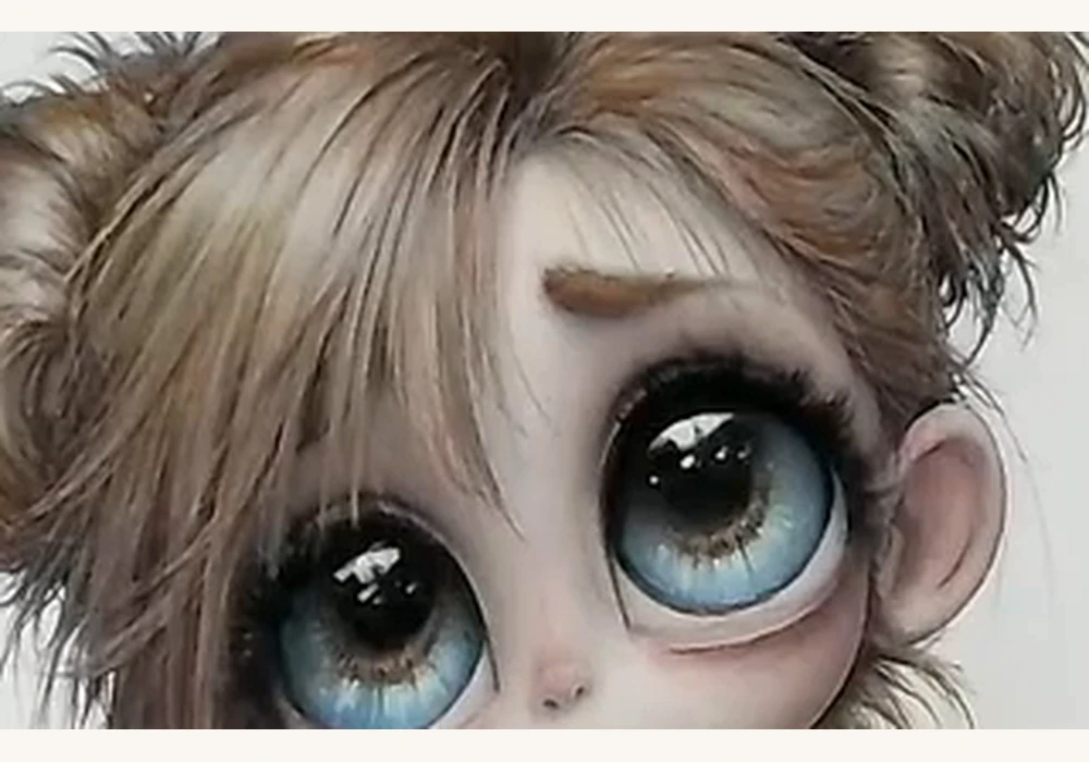 Focal point
Iris depth
A dark gradient above, luminous blue below and preserved white reflections.
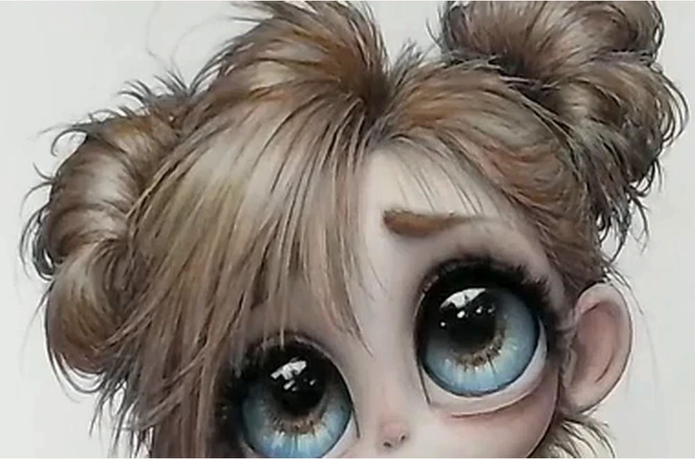 Form
Form
Distinct strands
Value changes separate the masses without turning every hair into an identical line.
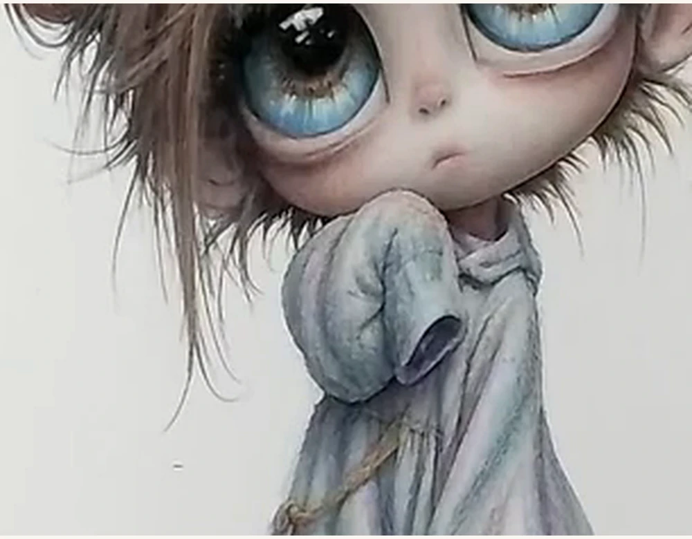 Texture
Soft folds
Build the garment with a pale, muted base and cooler shadows while preserving its soft feel. The suggested palette is an option, not an exact identification of every pencil shown in the reference.
Method recap
The key is to build, not just fill
Test
Check important mixtures on a separate sheet.
Base
Start each area with light, even pressure.
Direction
Follow the flow of the shape and texture.
Highlights
Preserve the brightest areas from the beginning.
Contrast
Reserve the greatest intensity for the eyes and face.
Final result
Give every layer a specific purpose
First test, then establish the base, shape the form and use stronger pressure only at the end.
Leave a Reply
You must be logged in (Español) to post a comment.